


Every project has the ultimate goal to be a success.There are many factors which are measured inorder to reach it.When talking about success,the factors that come into our mind are
- Quality
- Satisfaction
- Performance
There are many techniques through which we can identify the factors which can have a impact of the outcome.Let us now look at PARETO CHART or the 80/20 rule.
PARETO CHART:
According to Project Management,Pareto chart is ” A technique used to identify the few factors that have the greatest impact on an outcome, result, or on measures of quality, satisfaction or performance”A Pareto chart, also called a Pareto distribution diagram, is a vertical bar graph in which values are plotted in decreasing order of relative frequency from left to right.It is one of the most important tool used in Six Sigma and Total Quality Control
So why is it called the 80/20 rule?
It is an aphorism which asserts that 80% of outcomes (or outputs) result from 20% of all causes (or inputs) for any given event. In business, a goal of the 80-20 rule is to identify inputs that are potentially the most productive and make them the priority
In other words it is defined as 20% Effort (Input)materialises to 80%Result(Output)

Where can Pareto analysis be used?
Eventhough 80-20 axiom is frequently used in business and economics,it can be applied in any field like
- When analyzing data about the frequency of problems or causes in a process
- When there are many problems or causes and you want to focus on the most significant
- When analyzing broad causes by looking at their specific components
- When communicating with others about your data
- Spending Habits
- Personal Finance
- And even Personal Relationships(really useful J)
Let us look at a brief procedure of how to apply Pareto Analysis
- Identify the problem or area of focus.
- Identify sources of data.
- Collect data.
- Tabulate data, using a table or matrix to display frequencies of occurrence.
- Transfer the tabulated data into a distribution chart.
- Plot the cumulative frequency.
- Analyze results and determine next steps.
If we go in depth we should go as to
- Decide what categories you will use to group items.
- Decide what measurement is appropriate. Common measurements are frequency, quantity, cost and time.
- Decide what period of time the Pareto chart will cover: One work cycle? One full day? A week?
- Collect the data, recording the category each time, or assemble data that already exist.
- Subtotal the measurements for each category.
- Determine the appropriate scale for the measurements you have collected. The maximum value will be the largest subtotal from step 5. (If you will do optional steps 8 and 9 below, the maximum value will be the sum of all subtotals from step 5.) Mark the scale on the left side of the chart.
- Construct and label bars for each category. Place the tallest at the far left, then the next tallest to its right, and so on. If there are many categories with small measurements, they can be grouped as “other.”
Let us look at an example of how SEO engine fault has reduced a companies website trafficking
- Create a vertical bar chart with causes on the x-axis and count (number of occurrences) on the y-axis.
- Arrange the bar chart in descending order of cause importance that is, the cause with the highest count first.
- Calculate the cumulative count for each cause in descending order.
- Calculate the cumulative count percentage for each cause in descending order. Percentage calculation: {Individual Cause Count} / {Total Causes Count}*100
- Create a second y-axis with percentages descending in increments of 10 from 100% to 0%.
- Plot the cumulative count percentage of each cause on the x-axis.
- Join the points to form a curve.
- Draw a line at 80% on the y-axis running parallel to the x-axis. Then drop the line at the point of intersection with the curve on the x-axis. This point on the x-axis separates the important causes on the left (vital few) from the less important causes on the right (trivial many).
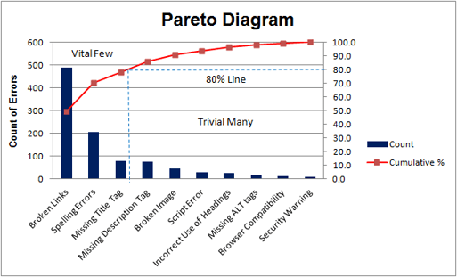
- The above is an example of a Pareto diagram, using sample data showing the relative frequency of causes for errors on websites. It enables you to see what 20% of cases are causing 80% of the problems and where efforts should be focussed to achieve the greatest improvement. In this case, we can see that broken links, spelling errors and missing title tags should be the focus.
- The value of the Pareto Principle for a project manager is that it reminds you to focus on the 20% of things that matter. Of the things you do for your project, only 20% are crucial. That 20% produces 80% of your results. Identify, and focus on those things first, but don't entirely ignore the remaining 80% of the causes.
Advantages Of Pareto Analysis:
- It shows you the problems to focus on to get a significant improvement.
- It helps you focus on solving the few causes generating the most problems.
- It helps you visualize problems quickly, so it is an excellent visual communication tool
- It helps you segregate the problems and their causes.
- And the last, drawing Pareto is easy.
Further Reading and References:
- https://www.brighthubpm.com/project-planning/57119-when-do-you-need-to-use-a-pareto-chart/
- https://project-management.com/pareto-chart-what-when-how/
- https://whatis.techtarget.com/definition/Pareto-chart-Pareto-distribution-diagram
- https://www.projectmanagement.com/wikis/233074/Pareto-Analysis
- https://www.investopedia.com/terms/1/80-20-rule.asp
- https://www.project-management-skills.com/pareto-chart.html


